Show your true colours!
We’re seeing a real push from designers to get away from the ““banner and three blocks” (or what I like to call “the meat and three veg”) approach to visual styling. And we’re seeing it pop up in all areas of design.
Colour
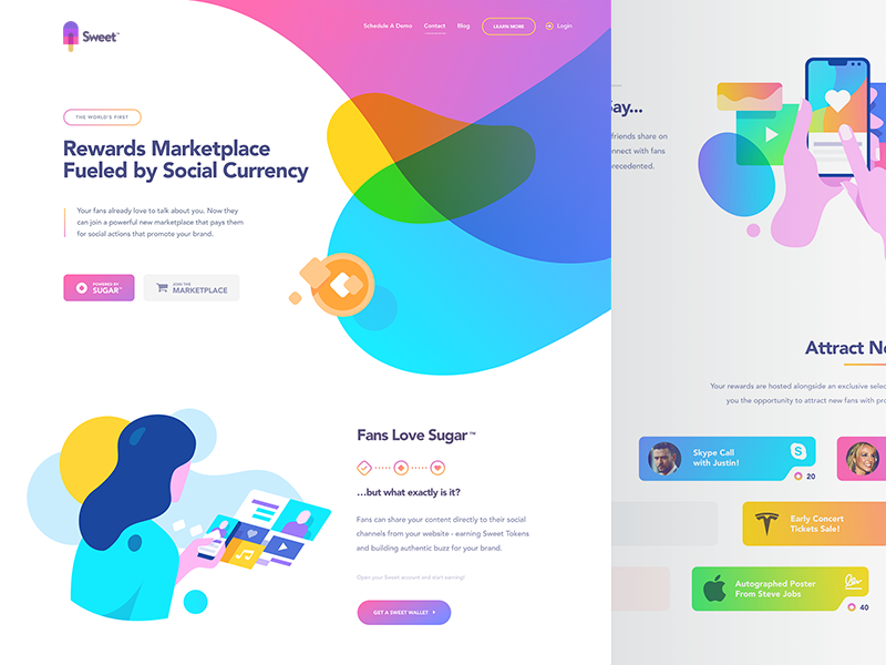
There has been a rise in the uptake of visual techniques such as colour blocking, duo-toning and multi-step gradients. All of these are new tools for digital designers and are thanks to modern browsers supporting technologies like CSS3 and HTML5.
The colours themselves used have also become much more unusual, with contrasting and competing colours selected over ‘safer’ palettes. We’ve seen a huge uptake in “retro” “70s” or 60s palettes and also a lunge in the other direction with the use of blacks and fluorescents.
Incoming fluorescence
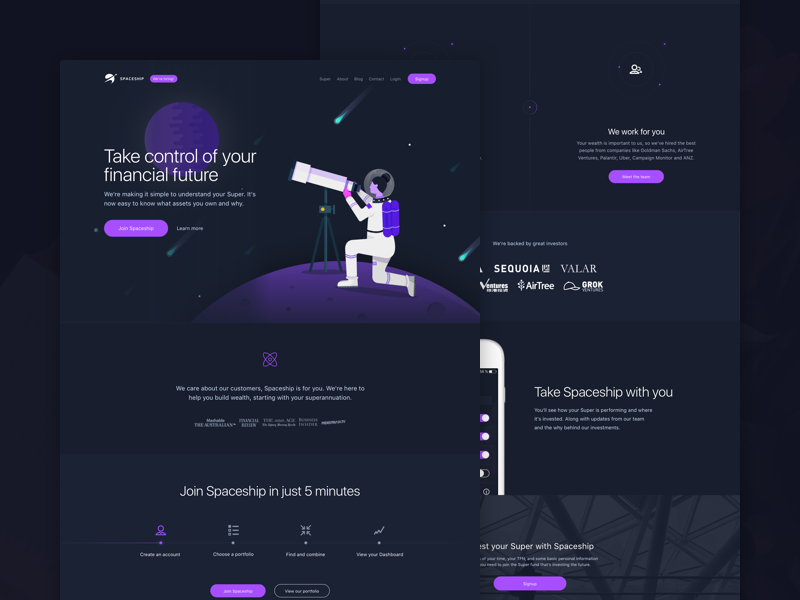
Spaceship super uses a midnight blue, a highlight of bright purple and a set of other bright colours that print designers could only dream of.
Bold and brave
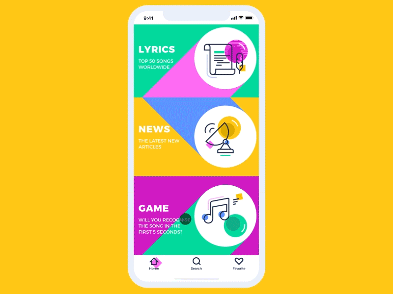
With transitioning blocks of colour that change when the user scrolls, this music app maquette is blurring the lines between interface and illustration. Again, it’s the brand that really wins out here.
All the way back to retro
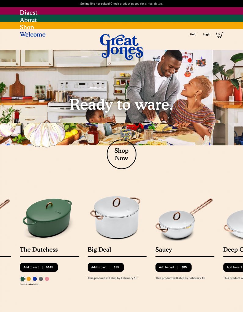
On Great Jones we’re seeing a balancing act here between thoroughly modern interactive elements (such as that non -standard menu) coupled with an 70s colour scheme and font choice. I’d say the colour palette here is evoking memories of simpler times, where mum made casseroles and kids played in the street, playing to this companies brand values.
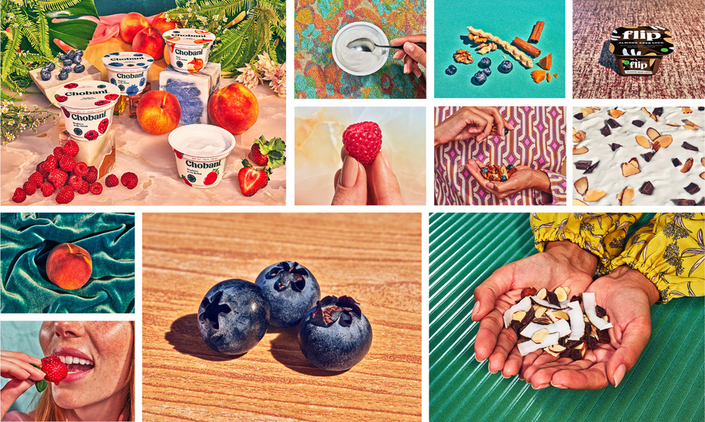
See also, the Chobani rebrand, it’s not solely digital but the use of retro colour scheme deserves an honorary mention.
Typography
The advent of @font-face, Google fonts and other new typographic technology has seen a huge uptake in both unusual typefaces and grid-breaking typographic layouts.
Brutalist
We’ll be seeing a lot more layouts inspired by past design movements like cubism and de Stijl. While not appropriate for all brands and messages, it’s pattern busting layouts like these that show us what is possible and give us a wider range of tools make interfaces that reflect brand values & voices.
The rise of the Serif

Serif fonts: (Like Times New Roman - the ones with “the little bits on the the ends of the letters”) have been typically seen as old fashioned and stuffy. In addition to the feel of them, it used to be that, serif fonts didn’t play so well on a typical users monitor, the serifs causing blurriness and aliasing issues.
Again, tech advancements to the rescue. Consumer uptake of “Retina” or 4K monitors and devices (e.g. all new phones) means that more and more users are now enjoying crisp fonts (with none of the fuzziness from above). Allowing the little bits on the end to shine.
So we’re seeing a huge rise in bold, generous and curvy serif fonts.
Made.com is pairing their sans serif and modernist logo with bold serif headers.
Layout/hierarchy
The popularisation and understanding of user experience has introduced a more purposeful approach to page layouts. Rules can be broken and grids can be smashed once you understand your users journey though your brand.
What fold?
We’re seeing way more consumer sites leaning in to ”the scoll”. Reserving that “above the fold” space for a single static message (The carousel will not be returning for 2019)(http://shouldiuseacarousel.com/). These large messages often change frequently, and are the easiest thing to personalise with a marketing tool.
From a design perspective, sites feel much more luxurious as we’re not cramming everything in to a short and wide rectangle (an awkward shape at the best of times), the feel also comes from the oversaturation of that short and wide banner.
The key to these is knowing your users, and adapting that space for them, not for you, Out are the vanity slides that are ignored by users but mandated by management.
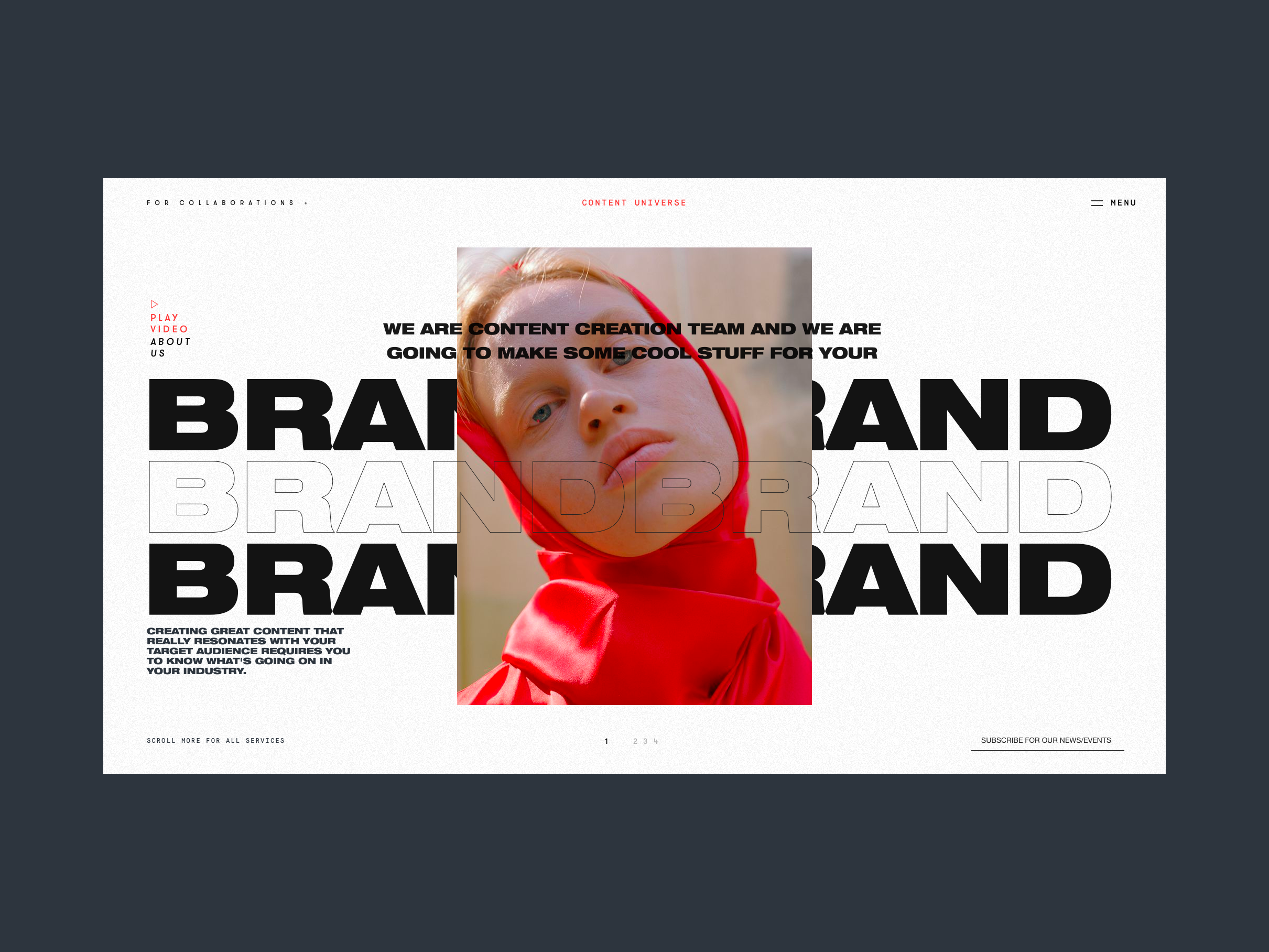
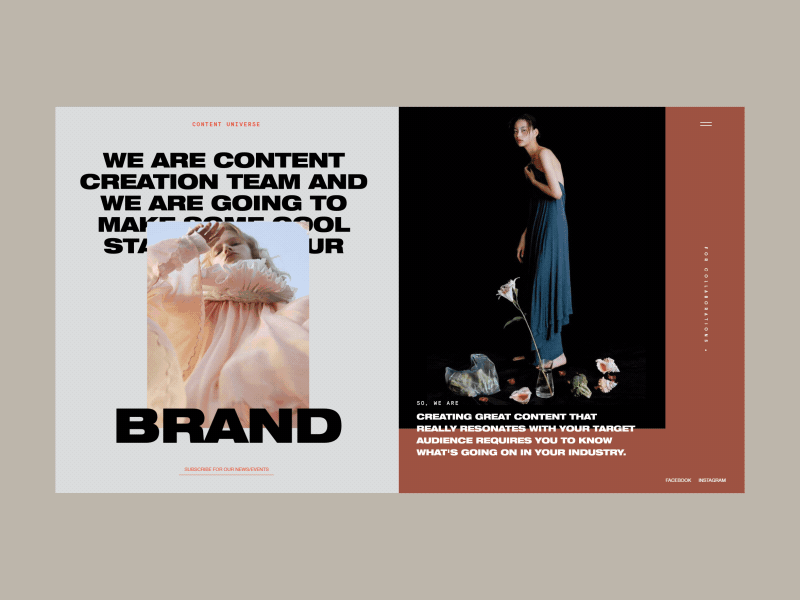
The broken grid
These overlapping and dynamic layouts are becoming more and more common. While initially only found on edgy Studio and Agency sites to show off skill, this style has spread and we’re now seeing it pop up on fashion and eCommerce sites.
Characterised by overlapping copy & elements and international misalignments this is another trend that takes its cue from the avant garde & post modern graphic design movements.
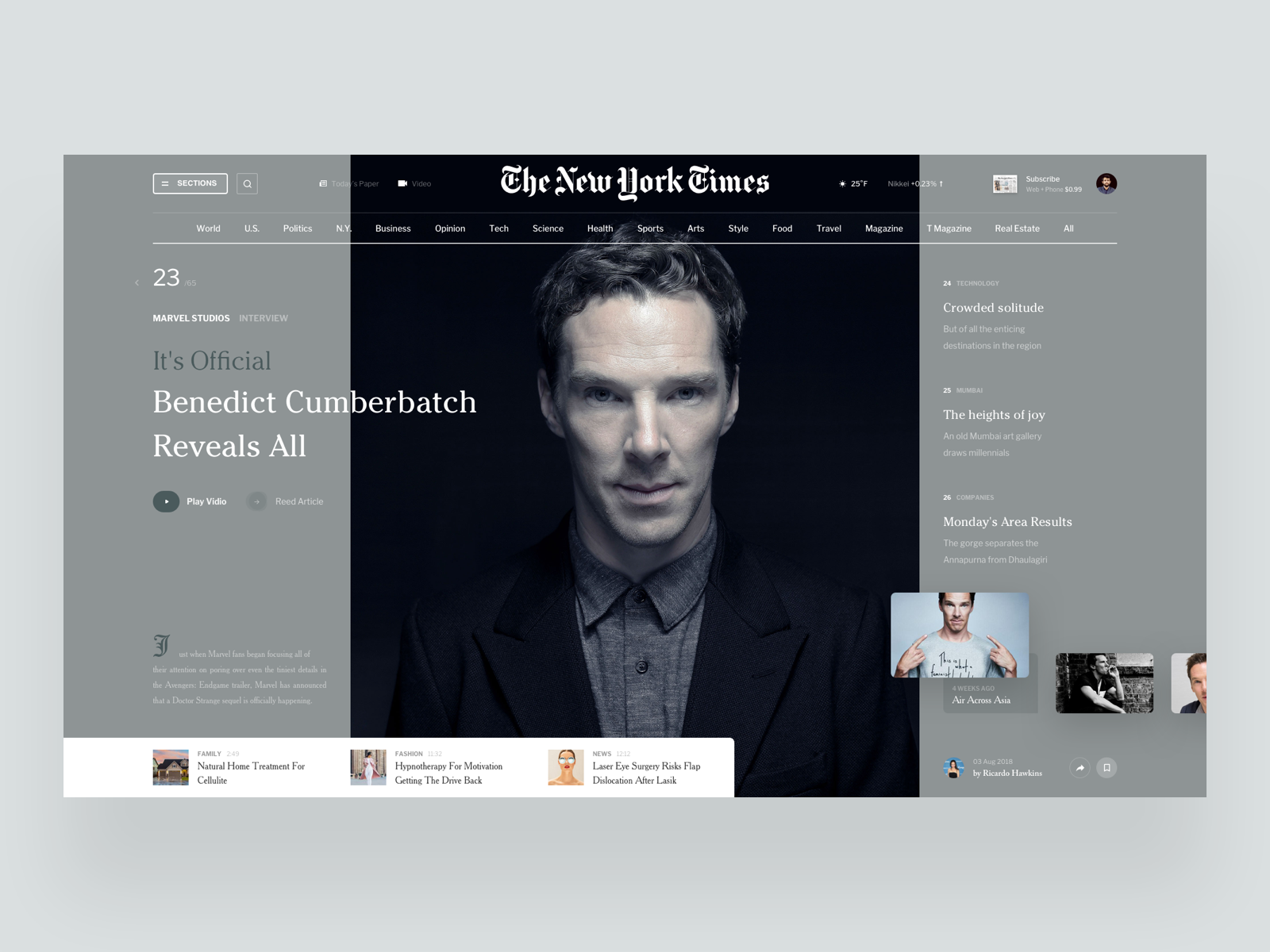
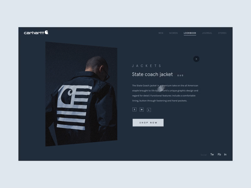
High quality bespoke imagery/photography
As with brand guidelines generally, photography is now being looked at more holistically. Rather than having many different focal points, colour treatments and angles, there is a very strong trend towards a uniform photographic style that compliments and enhances the brand.
Single focus


As with the fold busting layouts above, the single focal point of these images is such a divergence from our usually content crammed screens that we can’t help but look. This style of studio shot is already extremely common in eCommerce, however we’re seeing more and more of this style in editorial and content images.
No camera, no problem
It may be the case that photography isn’t available or even appropriate for a use case. Rather than seeking out stock photography, more and more we’re seeing brands use both typical and 3D illustrations to lift their content.
What does all this mean for you?
Be Bold!
From contrasting colour schemes to grid-breaking layouts, digital design is becoming more adventurous. Users are expecting unique and on brand visual experiences. And sticking with what’s safe can mark you as old hat. Don’t be scared to stand out from the crowd.