Goodbye static design
Expect to see a lot more movement in websites throughout 2019. New technology and standards (once cordoned off and labeled ‘experimental’ and ‘unstable’) have become available to almost all desktop and mobile web browsers, opening the door to interfaces that are both exciting and usable.
From the scene that springs to life as you scroll down the page, to subtle feedback and micro interactions in response to an users action, purposeful motion creates a sense of vibrancy and participation. Transforming repetitive and endless scrolling your users are so used to, to a unique experience.
Branded animation
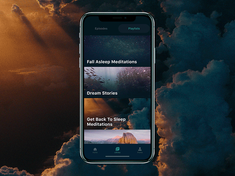
The initial impression of SlumberApp is of something very minimal. It’s simply typography and photography, right? Wrong.
Some very fine details are working together here to build this sense of elegant minimalism; the custom images, the clear and very easy to read typography, the restricted colour pallette. However the biggest part of this interface’s personality is the animation.
Note the gentle, almost dreamy way the titles waft over the images on the cards as the user scrolls. Not enough to distract, but just enough to leave that dreamy impression.
The transition when a card is selected is also of note; the title and image are retained, reinforcing to the user which item was selected, while the content comes in from underneath.
This is a great example of animation reinforcing a brand personality. When your product is all about restful sleep, you want your interface to reflect that. It’s not enough to pop in a few generic cross fades, parallaxing or sliders into your interface. Think of animation as a brand component, like you would your brand colours, or typography. The animation you use should reflect YOUR brand in motion.
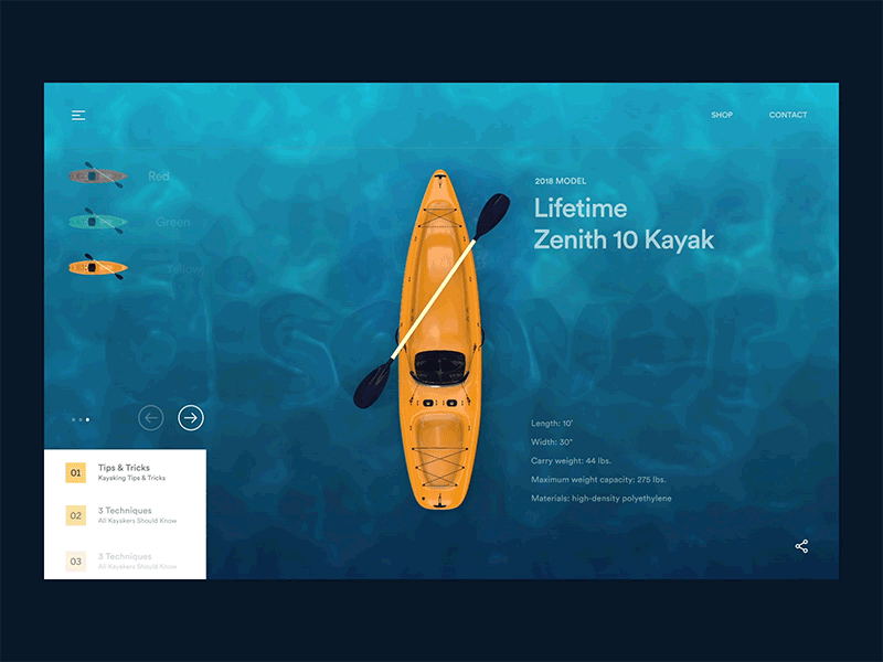
This animation gives the user a look at three sides of the kayak while adjusting to fit in better with it’s content, this one is also possibly a wait time distrator.
We’re also seeing ripples of the water, both passively in the texture but also as the kayak moves around. And bonus, the “sand” under the water features what we think is the logo of the store ("discover"?); here is animation literally reinforcing brand values.
Object Permanence
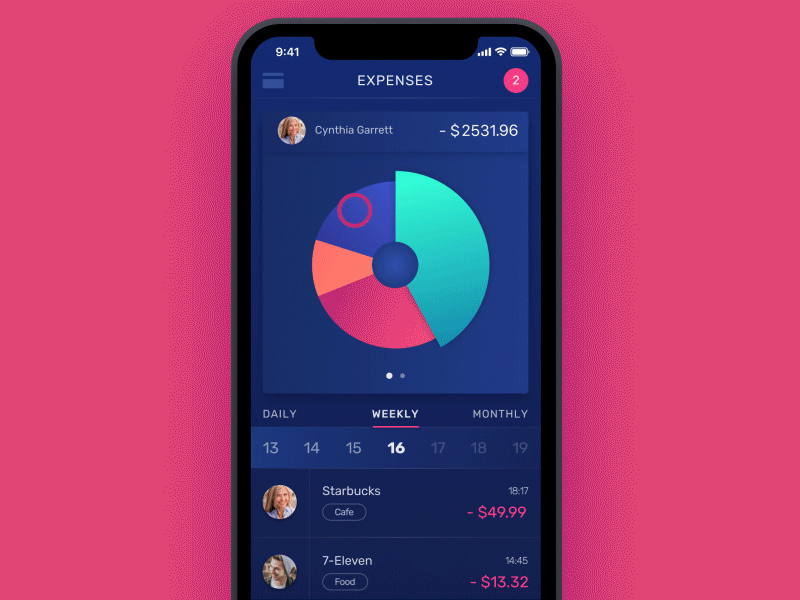
Animation can play a very functional role in interface design; Note how in the above, the segments of the pie chart animate to their corresponding elements in the bar chart. The standard woay to do this would have been to simply switch views with no trasiting, but then we would lose the visual connection between the pie and the bar. This animation is key for the users perception of continuity.
Motion can also disguise wait times; watch when the user selects a purchase item to see more information about it, This app could be connecting to a server and fetching that information while all the interface elements are sliding up into place. Giving the impression that there was no loading at all.
We have the technology

The ubiquity of most trends hinges on their accessibility, and this one is no different; CSS has included the capacity for animation since 2011, but an understanding of movement was not an intrinsic skill to either developers or designers. Without an understanding of how things should move, or if things should move at all, and software that only really supported static designs, the uptake was slow.
Both the development and design fields have been embracing motion eagerly as it’s likely linked to animation being a signal of a premium design - even (or especially) to laypeople. Historically it’s been difficult to make movement look right in the context of an interface, so when it works, it’s impressive.
We’re seeing both designers and developers develop their motion skills now thanks to more software that allows visualisation and development of motion. This refinement is circular, a better eye for motion means more complicated requests from the technology which means the development of better software and better specifications. We’re also seeing more and more animation libraries that are making well timed animations accessible to more people.
All of this means that motion in interface design isn’t going anywhere and will continue to mature as technology advances. Its moved from a premium nice-to-have, to an mandatory aspect of interface design, user experience and even branding. Expect to see it everywhere, from enhancing the banality of ordering a pizza to managing your Etherium.
